Tom Garncarz

Product Designer

Email me!
Clinical Problem List Redesign

athenahealth

//

May 2021

Information architecture

B2B

Desktop

User research

Healthcare

athenaClinicals is athenahealth's physician-facing EHR (electronic health record) product, used for documenting patients visits, pharmaceutical orders, government measure performance, and more.


A major component of the physician experience is the problem list, which is essentially a catalogue of all of the various conditions faced by a patient. This page details a full redesign effort that I led over the course of 2021.

Introduction

In early 2021, I took on a project to begin a redesign of athenahealth’s patient problem list.


The problem list serves as a sort of collection of a patient's various different conditions, covering everything from a minor acute event like a twisted ankle or sore throat, all the way to more series, chronic illnesses like type 2 diabetes or cancers. An initial glance through the problem list should yield the first few footholds towards developing a fuller grasp of a patient's needs. 
However, the existing problem list suffered from a series of well-known issues:


  1. Providers were divided on whether diagnoses made during an exam ought to be automatically promoted to the problem list
  2. Short-term acute problems tended to clutter up the list for lack of an easy way to remove them
  3. Complex patients' lists tended to be extensive and difficult to parse.


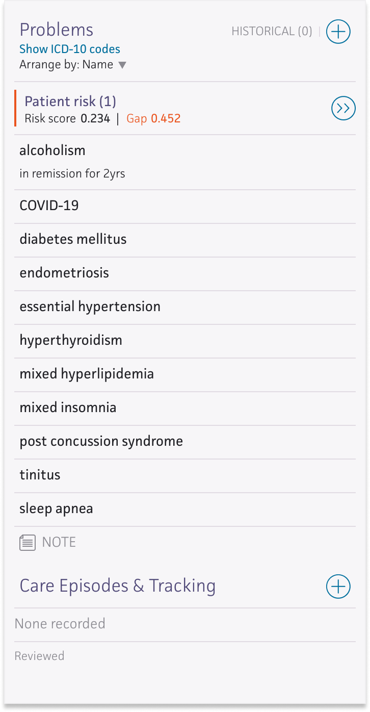
All of these problems contributed to a piece of chart architecture that was considered unreliable and insufficient for users' immediate needs.

The old Problem List: barebones organizational functionality and cumbersome controls meant that the problem list rarely lived up to its potential as a source of truth about a patient's condition.

Research

Because the problem list represents a core component of the physician workflow, substantial user research was critical to ensure that our team was making improvements where they would be most valuable, without creating unnecessary disruption for physician users. Interviews with physicians yielded a wealth of impassioned, but sometimes conflicting, feedback around how the Problem List ought to work.

Numerous user interviews, surveys, and resonance testing sessions yielded a series of insights that yielded high-level tenets for the redesign effort:

INSIGHT 1

Users need to be able to group problems in ways that matter.

INSIGHT 2

A single list of uncategorized problems is hard to parse quickly.

INSIGHT 3

Tidying up the problem list requires a ton of duplicative work.

INSIGHT 4

Competition arises when multiple doctors work on the same patient.

TENET 1

When problem lists get too messy, physicians stop using them. 

TENET 2

Users need to be able to take action on multiple problems at once.

TENET 3

Usability improvements are crucial to improving clinical reliability.

TENET 4

Doctors need their own user-specific viewing settings.
Redesign

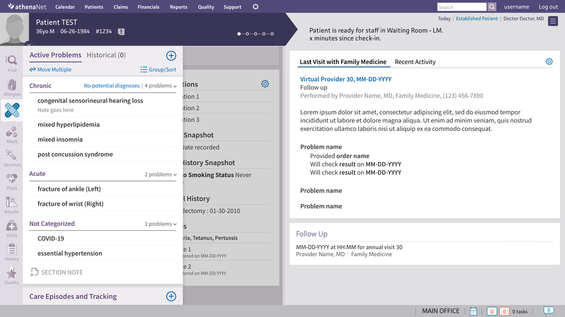
With these high-level goals in mind, early iterations focused heavily on how best to handle meaningful problem categorization.


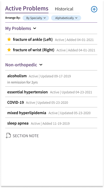
Feedback from primary care providers suggested that categorization of chronic versus acute problems would be a big improvement over the current setup, while specialists were primarily interested in seeing problems relevant to their own specialty first.


The core design problem was how best to present these categories in a data-dense environment—while ensuring a net-reduction in overall clutter.

A constant challenge was finding a hierarchy that would be extensible for different categorization schemes in the future, without being too significant of a departure for long-time users.

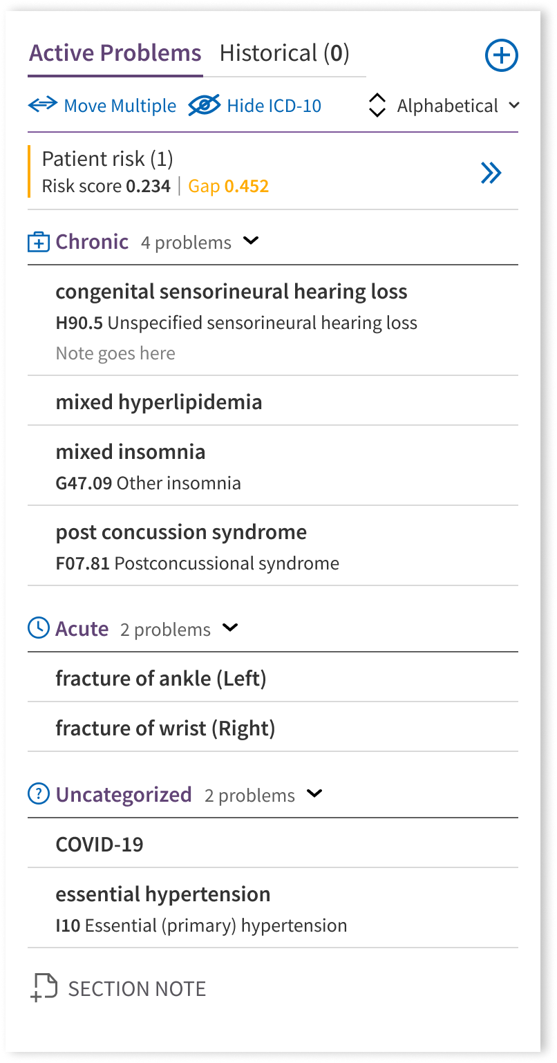
Eventually, differentiating Chronic and Acute problems was determined to be the most broadly useful categorization for the team to pursue at first, with intent to be able to reuse the architecture in the future for more specialty-focused categorization.


The final architecture ended up looking like this:

A solid header visual helped the overall design come together by designating an obvious space for list manipulation tools.

This organization tested well with users, who were very happy with the improved readability and organization. Furthermore, features like additional viewing settings and bulk action were a hit with providers concerned about manipulating the list as much as consuming it.

Development and Future Work

The new problem list was released to clinical users in 2022 and performed well at our high-level goals of seeing more problems effectively categorized and organized, thereby making sure that providers have accurate, up-to-date records of patients' problems.

While creating a healthy working space for physician users is its own benefit, ensuring the integrity of the problem list also enables it to act as a strong foundation for future design goals in the space—namely, creating a hub for physicians to learn about all related information to a problem in a single, consolidated space.


Without a strong, reliable problem list, this next step would have been impossible; now, we're well-equipped to make it that must faster and easier for physicians to get up to speed on their patients' stories.

The next step: comprehensive data visualization and tracking of problem-related information over time.

To timeline

© Tom Garncarz 2025

Tom Garncarz

Product Designer

Send me an email!

Clinical Problem List Redesign

athenahealth

//

May 2021

Information architecture

B2B

Desktop

User research

Healthcare

athenaClinicals is athenahealth's physician-facing EHR (electronic health record) product, used for documenting patients visits, pharmaceutical orders, government measure performance, and more.


A major component of the physician experience is the problem list, which is essentially a catalogue of all of the various conditions faced by a patient. This page details a full redesign effort that I led over the course of 2021.

Introduction

In early 2021, I took on a project to begin a redesign of athenahealth’s patient problem list.


The problem list serves as a sort of collection of a patient's various different conditions, covering everything from a minor acute event like a twisted ankle or sore throat, all the way to more series, chronic illnesses like type 2 diabetes or cancers. An initial glance through the problem list should yield the first few footholds towards developing a fuller grasp of a patient's needs. 
However, the existing problem list suffered from a series of well-known issues:


  1. Providers were divided on whether diagnoses made during an exam ought to be automatically promoted to the problem list
  2. Short-term acute problems tended to clutter up the list for lack of an easy way to remove them
  3. Complex patients' lists tended to be extensive and difficult to parse.


All of these problems contributed to a piece of chart architecture that was considered unreliable and insufficient for users' immediate needs.

The old Problem List: barebones organizational functionality and cumbersome controls meant that the problem list rarely lived up to its potential as a source of truth about a patient's condition.

Research

Because the problem list represents a core component of the physician workflow, substantial user research was critical to ensure that our team was making improvements where they would be most valuable, without creating unnecessary disruption for physician users. Interviews with physicians yielded a wealth of impassioned, but sometimes conflicting, feedback around how the Problem List ought to work.

Numerous user interviews, surveys, and resonance testing sessions yielded a series of insights that yielded high-level tenets for the redesign effort:

INSIGHT 1

Users need to be able to group problems in ways that matter.

INSIGHT 2

A single list of uncategorized problems is difficult to parse quickly.

INSIGHT 3

Tidying up the problem list requires a ton of duplicative work.

INSIGHT 4

Competition arises when multiple doctors work on the same patient.

DESIGN TENET 1

When problem lists become too messy, physicians stop using them.

DESIGN TENET 2

Users need to be able to take action on multiple problems at once.

DESIGN TENET 3

Usability improvements are crucial to improving clinical reliability.

DESIGN TENET 4

Doctors need their own user-specific viewing settings.
Redesign

With these high-level goals in mind, early iterations focused heavily on how best to handle meaningful problem categorization. Feedback from primary care providers suggested that categorization of chronic versus acute problems would be a big improvement over the current setup, while specialists were primarily interested in seeing problems relevant to their own specialty first.


The core design problem was how best to present these categories in a data-dense environment—while ensuring a net-reduction in overall clutter.

A constant challenge was finding a hierarchy that would be extensible for different categorization schemes in the future, without being too significant of a departure for long-time users.

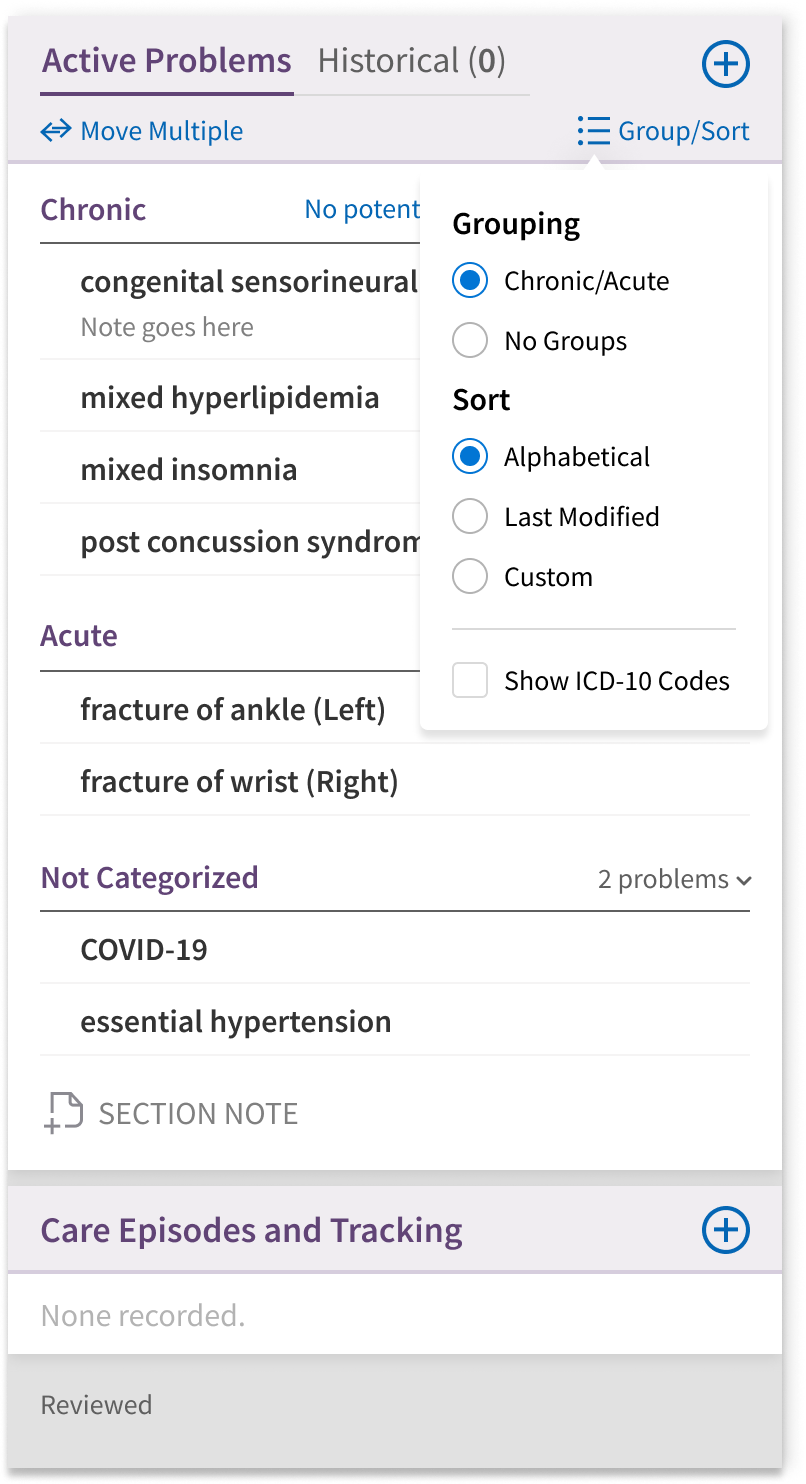
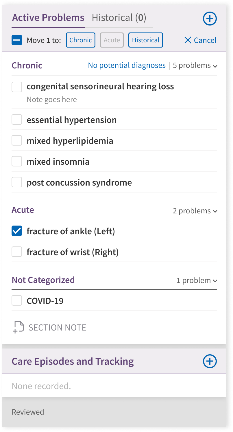
Eventually, differentiating Chronic and Acute problems was determined to be the most broadly useful categorization for the team to pursue at first, with intent to be able to reuse the architecture in the future for more specialty-focused categorization. As such, the final architecture ended up looking like this:

A solid header visual helped the overall design come together by designating an obvious space for list manipulation tools.

This organization tested well with users, who were very happy with the improved readability and organization. Furthermore, features like additional viewing settings and bulk action were a hit with providers concerned about manipulating the list as much as consuming it.
Development and Future Work

The new problem list was released to clinical users in 2022 and performed well at our high-level goals of seeing more problems effectively categorized and organized, thereby making sure that providers have accurate, up-to-date records of patients' problems.

While creating a healthy working space for physician users is its own benefit, ensuring the integrity of the problem list also enables it to act as a strong foundation for future design goals in the space—namely, creating a hub for physicians to learn about all related information to a problem in a single, consolidated space.


Without a strong, reliable problem list, this next step would have been impossible; now, we're well-equipped to make it that must faster and easier for physicians to get up to speed on their patients' stories.

The next step: comprehensive data visualization and tracking of problem-related information over time.

Back to the timeline

© Tom Garncarz 2025

Tom Garncarz

Product Designer

Send me an email!

Clinical Problem List Redesign

athenahealth

//

May 2021

Information architecture

B2B

Desktop

User research

Healthcare

athenaClinicals is athenahealth's physician-facing EHR (electronic health record) product, used for documenting patients visits, pharmaceutical orders, government measure performance, and more.


A major component of the physician experience is the problem list, which is essentially a catalogue of all of the various conditions faced by a patient. This page details a full redesign effort that I led over the course of 2021.

Introduction

In early 2021, I took on a project to begin a redesign of athenahealth’s patient problem list.


The problem list serves as a sort of collection of a patient's various different conditions, covering everything from a minor acute event like a twisted ankle or sore throat, all the way to more series, chronic illnesses like type 2 diabetes or cancers. An initial glance through the problem list should yield the first few footholds towards developing a fuller grasp of a patient's needs. 
However, the existing problem list suffered from a series of well-known issues:


  1. Providers were divided on whether diagnoses made during an exam ought to be automatically promoted to the problem list
  2. Short-term acute problems tended to clutter up the list for lack of an easy way to remove them
  3. Complex patients' lists tended to be extensive and difficult to parse.


All of these problems contributed to a piece of chart architecture that was considered unreliable and insufficient for users' immediate needs.

The old Problem List: barebones organizational functionality and cumbersome controls meant that the problem list rarely lived up to its potential as a source of truth about a patient's condition.

Research

Because the problem list represents a core component of the physician workflow, substantial user research was critical to ensure that our team was making improvements where they would be most valuable, without creating unnecessary disruption for physician users. Interviews with physicians yielded a wealth of impassioned, but sometimes conflicting, feedback around how the Problem List ought to work.

Numerous user interviews, surveys, and resonance testing sessions yielded a series of insights that yielded high-level tenets for the redesign effort:

INSIGHT 1

Users need to be able to group problems in ways that matter.

INSIGHT 2

A single list of uncategorized problems is difficult to parse quickly.

INSIGHT 3

Tidying up the problem list requires a ton of duplicative work.

INSIGHT 4

Competition arises when multiple doctors work on the same patient.

DESIGN TENET 1

When problem lists become too messy, physicians stop using them. 

DESIGN TENET 2

Users need to be able to take action on multiple problems at once.

DESIGN TENET 3

Usability improvements are crucial to improving clinical reliability.

DESIGN TENET 4

Doctors need their own user-specific viewing settings.

Redesign

With these high-level goals in mind, early iterations focused heavily on how best to handle meaningful problem categorization. Feedback from primary care providers suggested that categorization of chronic versus acute problems would be a big improvement over the current setup, while specialists were primarily interested in seeing problems relevant to their own specialty first.


The core design problem was how best to present these categories in a data-dense environment—while ensuring a net-reduction in overall clutter.

A constant challenge was finding a hierarchy that would be extensible for different categorization schemes in the future, without being too significant of a departure for long-time users.

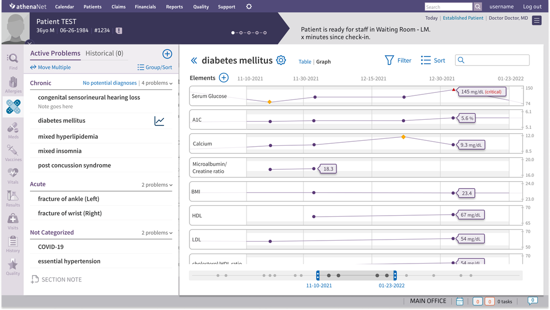
Eventually, differentiating Chronic and Acute problems was determined to be the most broadly useful categorization for the team to pursue at first, with intent to be able to reuse the architecture in the future for more specialty-focused categorization. As such, the final architecture ended up looking like this:

A solid header visual helped the overall design come together by designating an obvious space for list manipulation tools.

This organization tested well with users, who were very happy with the improved readability and organization. Furthermore, features like additional viewing settings and bulk action were a hit with providers concerned about manipulating the list as much as consuming it.
Development and Future Work

The new problem list was released to clinical users in 2022 and performed well at our high-level goals of seeing more problems effectively categorized and organized, thereby making sure that providers have accurate, up-to-date records of patients' problems.

While creating a healthy working space for physician users is its own benefit, ensuring the integrity of the problem list also enables it to act as a strong foundation for future design goals in the space—namely, creating a hub for physicians to learn about all related information to a problem in a single, consolidated space.


Without a strong, reliable problem list, this next step would have been impossible; now, we're well-equipped to make it that must faster and easier for physicians to get up to speed on their patients' stories.

The next step: comprehensive data visualization and tracking of problem-related information over time.