Tom Garncarz
Product Designer
Email me!
athenaClinicals Design Work
athenahealth
//
2020
Information architecture
B2B
Desktop
User research
Healthcare
athenaClinicals is athenahealth's physician-facing EHR (electronic health record) product, used for documenting patients visits, pharmaceutical orders, government measure performance, and more.
This page details a few of my key UX contributions as a senior designer on a scrum team at athena.
Patient Snapshot
Overview
- Physicians typically only have 1-2 minutes before a visit to understand why their patient is in the office and what's happened since they last met
- Athena's current patient chart architecture requires users to dig through a variety of tabs and folders to access information about a patient, leading to a frenetic scavenging workflow that often doesn't yield the information the physician needs
- To address this, I created a new "patient snapshot" feature designed to consolidate and curate relevant information before a visit
- Users were very positive about my concept, such that my team and I decided to take a step back and focus on a broader redesign of the chart with a heavier focus on this new approach
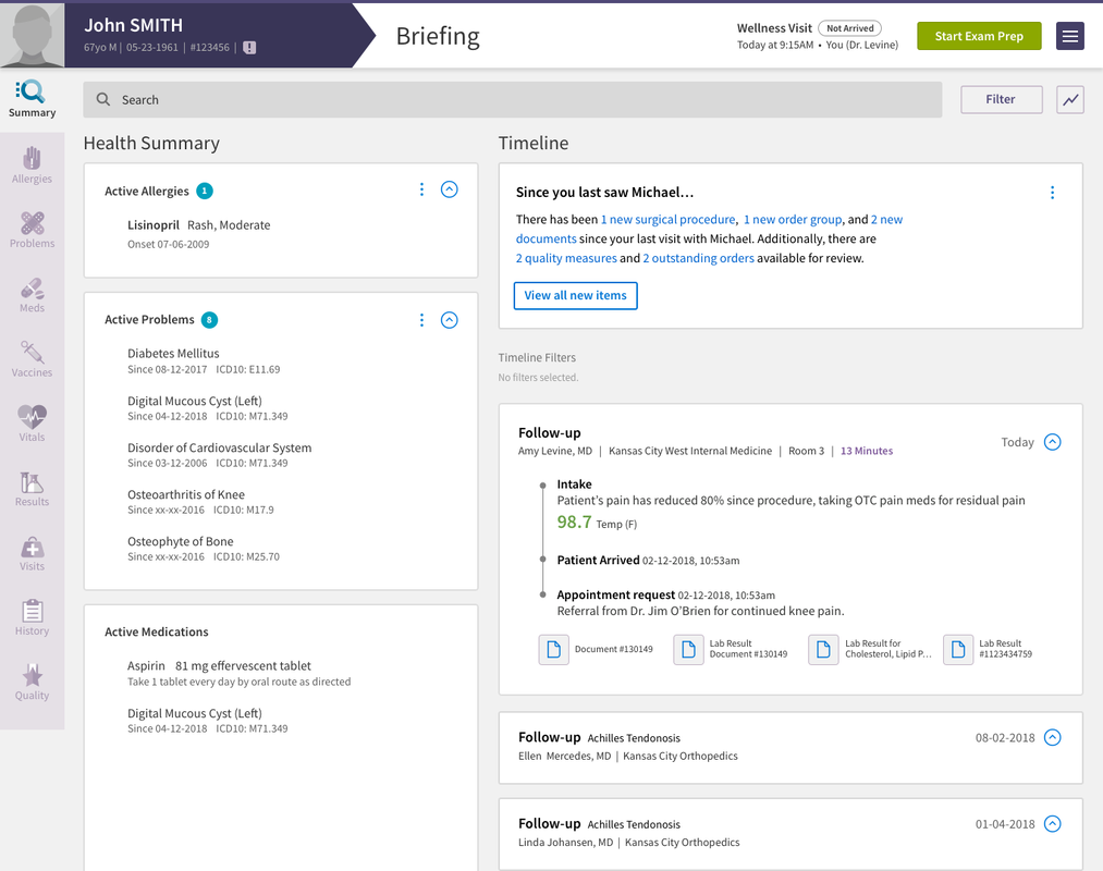
This Briefing page is the first thing that a provider sees before they begin a visit with a patient, so it's an important space for presenting information that might be relevant. The Patient Snapshot concept comprises the right hand column's cards (under Timeline).
One of the key difficulties facing physicians in the age of EHRs is the balance of documenting and referencing patient information while still maintaining meaningful "face time" with that patient during their visit, all within in a 15-minute time slot!
As such, one of the key areas of focus for the Clinicals team was creating a way for medical providers to get up to speed on a patient's story before a visit actually began, reducing the need for them to consult the computer during the clinical encounter.
Patient Snapshot was my contribution to this project, a concept meant to sort through all of the clinical events that have occurred since the physician last saw her patient, and surface them in an easy-to-consume format — a sort of Physician's Digest on a per-patient basis.
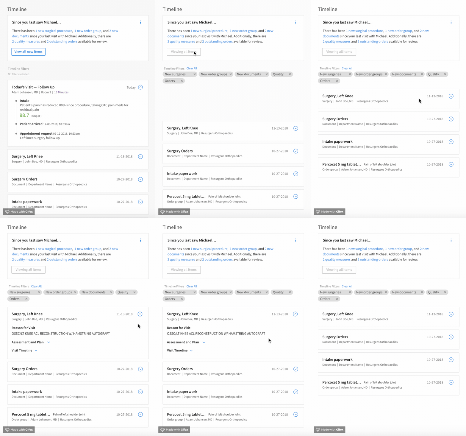
The "view new items" button filters down the patient's timeline of events to only the events that have happened since the physician's last visit with the patient.
The idea behind this concept was that, by consolidating all of the information a physician might not know about a patient in one location, and giving them the ability to dig into it as they saw fit, we would strike the balance between giving physicians a full view of the patient's profile, while still giving them the agency to make informational decisions and not cluttering their workspace.
Additionally, Snapshot worked as a filter for clinical information; selecting an item filtered the patient's timeline down to only the information relevant to the chosen item.
Because clinical events often have connections with lots of other pieces of data, like medication orders, documents, and office notes, giving physicians the full picture of a selected event was an important part of solving this problem.
Social History Redesign
Overview
- Medical Assistants typically ask patients a litany of questions about their "social history" during an office visit to understand things like whether they smoke, how much they exercise, and how they eat
- Athena's social history workflow was a long, untamed list of dropdown questions with no relation to one another and significant user friction
- My redesign introduced a branching logic to questions to only show questions that the MA needs to see, as well as a way for their organization to more clearly indicated that questions had been appropriately asked and answered
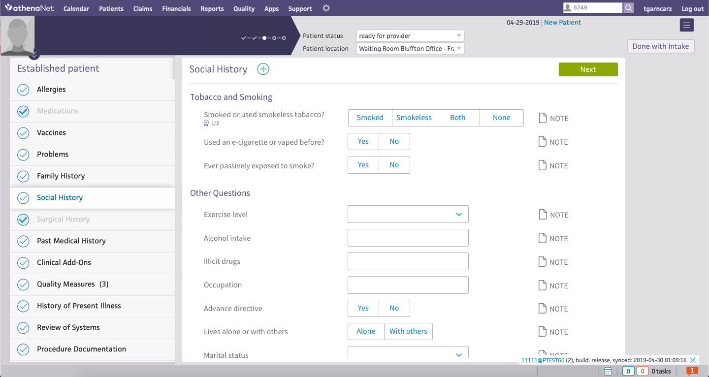
A patient's first encounter with clinical staff is typically with a Medical Assistant (MA) or nurse, who takes their weight, blood pressure, and asks some questions about their medical history and lifestyle.
In athenaClinicals, these historical and lifestyle questions are bundled into a section called "Social History." Because of significant technical debt and a bloated set of additional questions added over the years to meet client needs, Social History had become cumbersome for clients to use and difficult for us to improve.
Each question in Social History was an independent entity, and because the section had no built-in logic, questions that seemed like they ought to be related weren't, leading to confusion and unnecessary work.
For example, if an MA indicated that a patient had never been a smoker, they would still need to answer questions like "packs per day" or "years of tobacco use," despite the fact that they had logically already answered that question. The system wasn't helping our users here, and given how many different questions there were, the problem was getting severe.
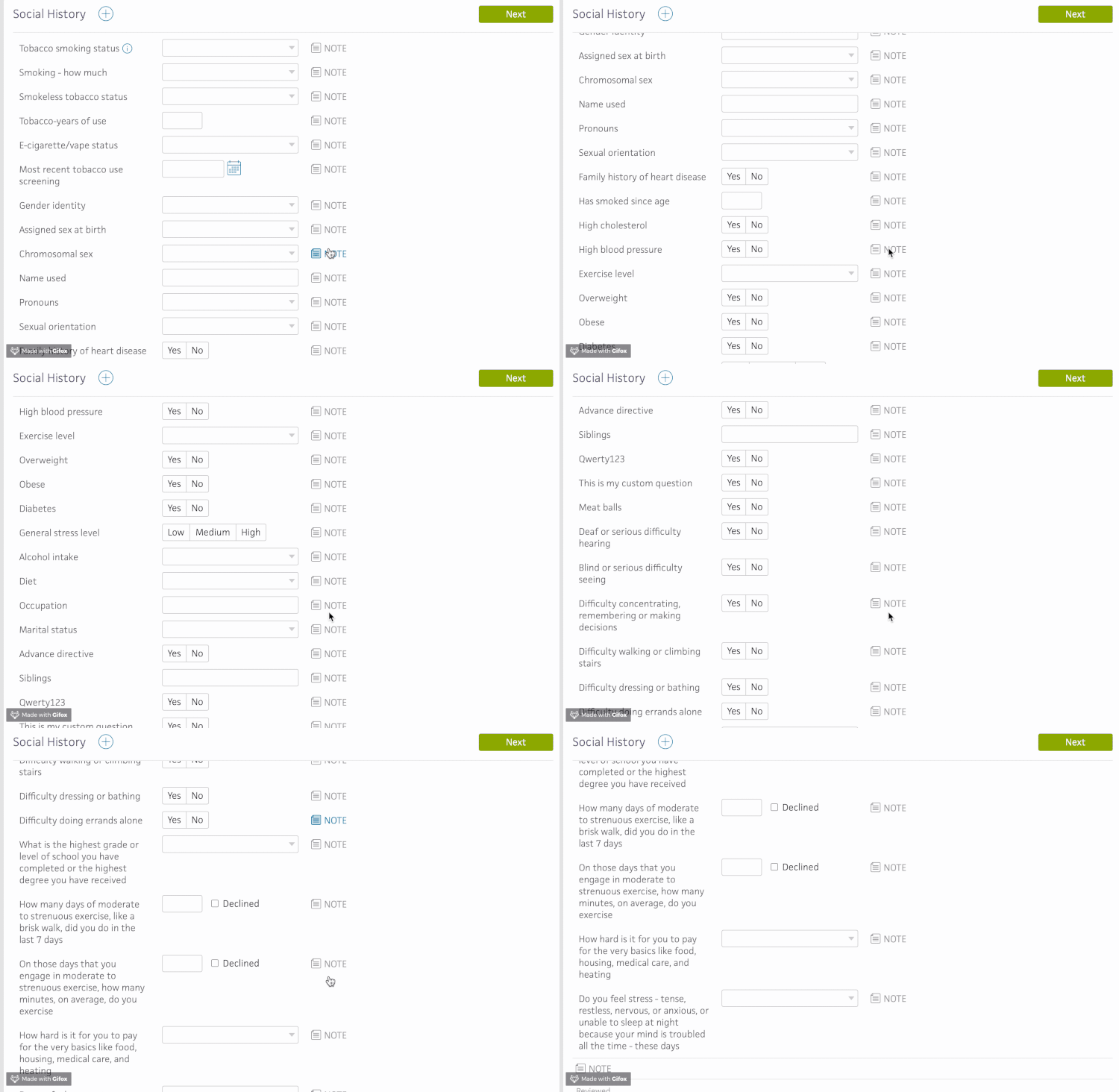
An example of the multitude of questions in the social history section, prior to the redesign.
As such, we began the process of revising and redesigning the Social History section, with the goals of creating a section that:
- Responded to client input
- Allowed them to more easily fulfill Quality measures (for reimbursement by Medicare), and
- Permitted the team to more easily add and modify the list of questions available to clients.
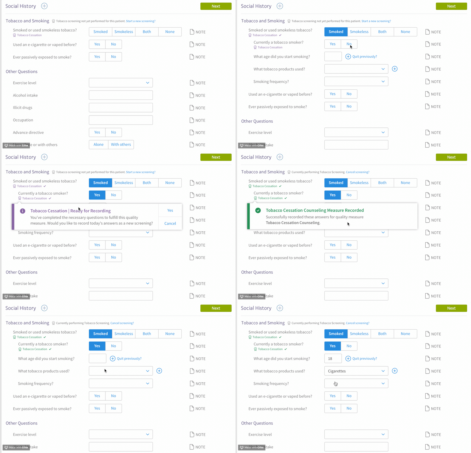
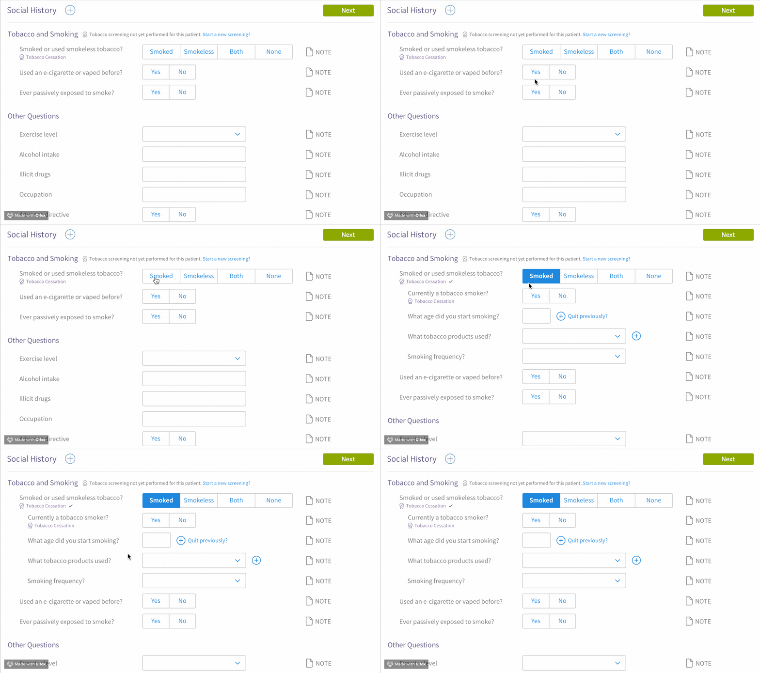
In this new design, questions are grouped into topic categories which are connected by branching logic.
In this example, if the patient indicates that they smoke tobacco, selecting the appropriate answer opens up a new list of questions for the user to answer. This is important to meeting our goals of decluttering the section and making it more coherent by only present questions that are relevant, and hiding the rest that aren't.
Another key goal of this system was to permit users to complete "Quality measures" while they document patient information.
Quality measures are essentially requirements established by Medicare and other government entities that ask practices to complete certain processes with their patients every so often.
One such measure is making sure that a patient is asked about their smoking behavior every year. By incorporating these measures directly alongside their relevant questions, this design helps users easily remember and complete the measures as a part of their normal work with the patient.

Tom Garncarz
Product Designer
Send me an email!
athenaClinicals Design Work
athenahealth
//
2020
Information architecture
B2B
Desktop
User research
Healthcare
athenaClinicals is athenahealth's physician-facing EHR (electronic health record) product, used for documenting patients visits, pharmaceutical orders, government measure performance, and more. This page details a few of my key UX contributions as a senior designer on a scrum team at athena.
Patient Snapshot
Overview
- Physicians typically only have 1-2 minutes before a visit to understand why their patient is in the office and what's happened since they last met
- Athena's current patient chart architecture requires users to dig through a variety of tabs and folders to access information about a patient, leading to a frenetic scavenging workflow that often doesn't yield the information the physician needs
- To address this, I created a new "patient snapshot" feature designed to consolidate and curate relevant information before a visit
- Users were very positive about my concept, such that my team and I decided to take a step back and focus on a broader redesign of the chart with a heavier focus on this new approach

This Briefing page is the first thing that a provider sees before they begin a visit with a patient, so it's an important space for presenting information that might be relevant. The Patient Snapshot concept comprises the right hand column's cards (under Timeline).
One of the key difficulties facing physicians in the age of EHRs is the balance of documenting and referencing patient information while still maintaining meaningful "face time" with that patient during their visit, all within in a 15-minute time slot!
As such, one of the key areas of focus for the Clinicals team was creating a way for medical providers to get up to speed on a patient's story before a visit actually began, reducing the need for them to consult the computer during the clinical encounter.
Patient Snapshot was my contribution to this project, a concept meant to sort through all of the clinical events that have occurred since the physician last saw her patient, and surface them in an easy-to-consume format — a sort of Physician's Digest on a per-patient basis.

The "view new items" button filters down the patient's timeline of events to only the events that have happened since the physician's last visit with the patient.
By consolidating all of the information a physician might not know about a patient in one location, and giving them the ability to dig into it as they saw fit, we would strike the balance between giving physicians a full view of the patient's profile and giving them the agency to make intentional decisions.
Additionally, Snapshot worked as a filter for clinical information; selecting an item filtered the patient's timeline down to only the information relevant to the chosen item.
Because clinical events often have connections with lots of other pieces of data, like medication orders, documents, and office notes, giving physicians the full picture of a selected event was an important part of solving this problem.
Social History Redesign
Overview
- Medical Assistants typically ask patients a litany of questions about their "social history" during an office visit to understand things like whether they smoke, how much they exercise, and how they eat
- Athena's social history workflow was a long, untamed list of dropdown questions with no relation to one another and significant user friction
- My redesign introduced a branching logic to questions to only show questions that the MA needs to see, as well as a way for their organization to more clearly indicated that questions had been appropriately asked and answered

A patient's first encounter with clinical staff is typically with a Medical Assistant (MA) or nurse, who takes their weight, blood pressure, and asks some questions about their medical history and lifestyle.
In athenaClinicals, these historical and lifestyle questions are bundled into a section called "Social History." Because of significant technical debt and a bloated set of additional questions added over the years to meet client needs, Social History had become cumbersome for clients to use and difficult for us to improve.
Each question in Social History was an independent entity, and because the section had no built-in logic, questions that seemed like they ought to be related weren't, leading to confusion and unnecessary work.
For example, if an MA indicated that a patient had never been a smoker, they would still need to answer questions like "packs per day" or "years of tobacco use," despite the fact that they had logically already answered that question. The system wasn't helping our users here, and given how many different questions there were, the problem was getting severe.

An example of the multitude of questions in the social history section, prior to the redesign.
As such, we began the process of revising and redesigning the Social History section, with the goals of creating a section that:
- Responded to client input
- Allowed them to more easily fulfill Quality measures (for reimbursement by Medicare), and
- Permitted the team to more easily add and modify the list of questions available to clients.
In this new design, questions are grouped into topic categories which are connected by branching logic.
In this example, if the patient indicates that they smoke tobacco, selecting the appropriate answer opens up a new list of questions for the user to answer. This is important to meeting our goals of decluttering the section and making it more coherent by only present questions that are relevant, and hiding the rest that aren't.

Another key goal of this system was to permit users to complete "Quality measures" while they document patient information.
Quality measures are essentially requirements established by Medicare and other government entities that ask practices to complete certain processes with their patients every so often.
One such measure is making sure that a patient is asked about their smoking behavior every year. By incorporating these measures directly alongside their relevant questions, this design helps users easily remember and complete the measures as a part of their normal work with the patient.

Tom Garncarz
Product Designer
Send me an email!
athenaClinicals Design Work
athenahealth
//
2020
Information architecture
B2B
Desktop
User research
Healthcare
athenaClinicals is athenahealth's physician-facing EHR (electronic health record) product, used for documenting patients visits, pharmaceutical orders, government measure performance, and more. This page details a few of my key UX contributions as a senior designer on a scrum team at athena.
Patient Snapshot
Overview
- Physicians typically only have 1-2 minutes before a visit to understand why their patient is in the office and what's happened since they last met
- Athena's current patient chart architecture requires users to dig through a variety of tabs and folders to access information about a patient, leading to a frenetic scavenging workflow that often doesn't yield the information the physician needs
- To address this, I created a new "patient snapshot" feature designed to consolidate and curate relevant information before a visit
- Users were very positive about my concept, such that my team and I decided to take a step back and focus on a broader redesign of the chart with a heavier focus on this new approach

This Briefing page is the first thing that a provider sees before they begin a visit with a patient, so it's an important space for presenting information that might be relevant. The Patient Snapshot concept comprises the right hand column's cards (under Timeline).
One of the key difficulties facing physicians in the age of EHRs is the balance of documenting and referencing patient information while still maintaining meaningful "face time" with that patient during their visit, all within in a 15-minute time slot!
As such, one of the key areas of focus for the Clinicals team was creating a way for medical providers to get up to speed on a patient's story before a visit actually began, reducing the need for them to consult the computer during the clinical encounter.
Patient Snapshot was my contribution to this project, a concept meant to sort through all of the clinical events that have occurred since the physician last saw her patient, and surface them in an easy-to-consume format — a sort of Physician's Digest on a per-patient basis.

The "view new items" button filters down the patient's timeline of events to only the events that have happened since the physician's last visit with the patient.
By consolidating all of the information a physician might not know about a patient in one location, and giving them the ability to dig into it as they saw fit, we would strike the balance between giving physicians a full view of the patient's profile and giving them the agency to make intentional decisions.
Additionally, Snapshot worked as a filter for clinical information; selecting an item filtered the patient's timeline down to only the information relevant to the chosen item.
Because clinical events often have connections with lots of other pieces of data, like medication orders, documents, and office notes, giving physicians the full picture of a selected event was an important part of solving this problem.
Social History Redesign
Overview
- Medical Assistants typically ask patients a litany of questions about their "social history" during an office visit to understand things like whether they smoke, how much they exercise, and how they eat
- Athena's social history workflow was a long, untamed list of dropdown questions with no relation to one another and significant user friction
- My redesign introduced a branching logic to questions to only show questions that the MA needs to see, as well as a way for their organization to more clearly indicated that questions had been appropriately asked and answered

A patient's first encounter with clinical staff is typically with a Medical Assistant (MA) or nurse, who takes their weight, blood pressure, and asks some questions about their medical history and lifestyle.
In athenaClinicals, these historical and lifestyle questions are bundled into a section called "Social History." Because of significant technical debt and a bloated set of additional questions added over the years to meet client needs, Social History had become cumbersome for clients to use and difficult for us to improve.
Each question in Social History was an independent entity, and because the section had no built-in logic, questions that seemed like they ought to be related weren't, leading to confusion and unnecessary work.
For example, if an MA indicated that a patient had never been a smoker, they would still need to answer questions like "packs per day" or "years of tobacco use," despite the fact that they had logically already answered that question. The system wasn't helping our users here, and given how many different questions there were, the problem was getting severe.

An example of the multitude of questions in the social history section, prior to the redesign.
As such, we began the process of revising and redesigning the Social History section, with the goals of creating a section that:
- Responded to client input
- Allowed them to more easily fulfill Quality measures (for reimbursement by Medicare), and
- Permitted the team to more easily add and modify the list of questions available to clients.
In this new design, questions are grouped into topic categories which are connected by branching logic.
In this example, if the patient indicates that they smoke tobacco, selecting the appropriate answer opens up a new list of questions for the user to answer. This is important to meeting our goals of decluttering the section and making it more coherent by only present questions that are relevant, and hiding the rest that aren't.

Another key goal of this system was to permit users to complete "Quality measures" while they document patient information.
Quality measures are essentially requirements established by Medicare and other government entities that ask practices to complete certain processes with their patients every so often.
One such measure is making sure that a patient is asked about their smoking behavior every year. By incorporating these measures directly alongside their relevant questions, this design helps users easily remember and complete the measures as a part of their normal work with the patient.
