Tom Garncarz

Product Designer

Email me!

EV Driver Mobile/Web App

ChargeLab

//

May 2022 - present

Interaction design

Information architecture

B2C

Mobile

User research

Climate

One of ChargeLab’s main products is a web and mobile application for helping electric vehicle (EV) drivers locate and use chargers.


Over the course of my time as the sole designer—followed by head of design—at ChargeLab, I completely redesigned both driver apps, with the goal of creating a fast, frictionless, and consistent experience on both platforms.
Scroll

Focal points

This section focuses in on a few specific user insights and how they informed my design decisions.

Speedy start

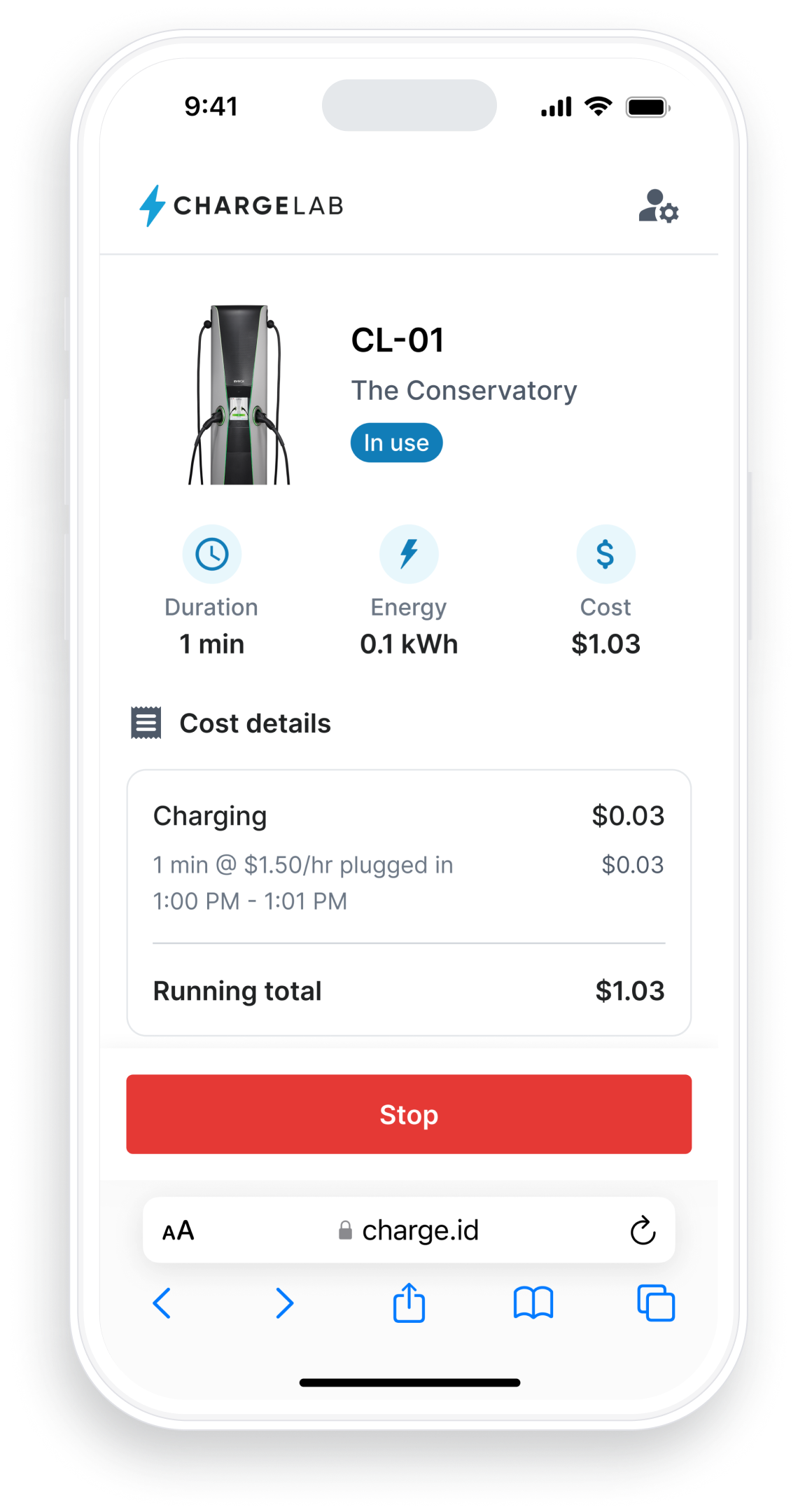
Because the infrastructure for EV charging is very much a work-in-progress, EV drivers often have to contend with a number of different services to find and use a charger, many requiring the user to download and learn a whole new app. Participants in driver research frequently expressed frustration with this slow start-up time, when they just wanted to get back on the road.

To achieve these goals, I redesigned the charging session workflow, with a focus on minimizing friction, surfacing only the most useful information, and avoiding the jargon that’s unfortunately common across the industry. I also designed this workflow to work in both the native and the web-based version of the app, allowing users to skip that extra app download.

The result is a workflow that puts EV drivers on a fast and clear path to getting back behind the wheel.

Scroll

Many, many of our users are first-time EV drivers, meaning they often don’t know what to do when they pull up to a charger.


It was important to segment each step in the process, while providing lots of feedback along the way.

Exploring the map

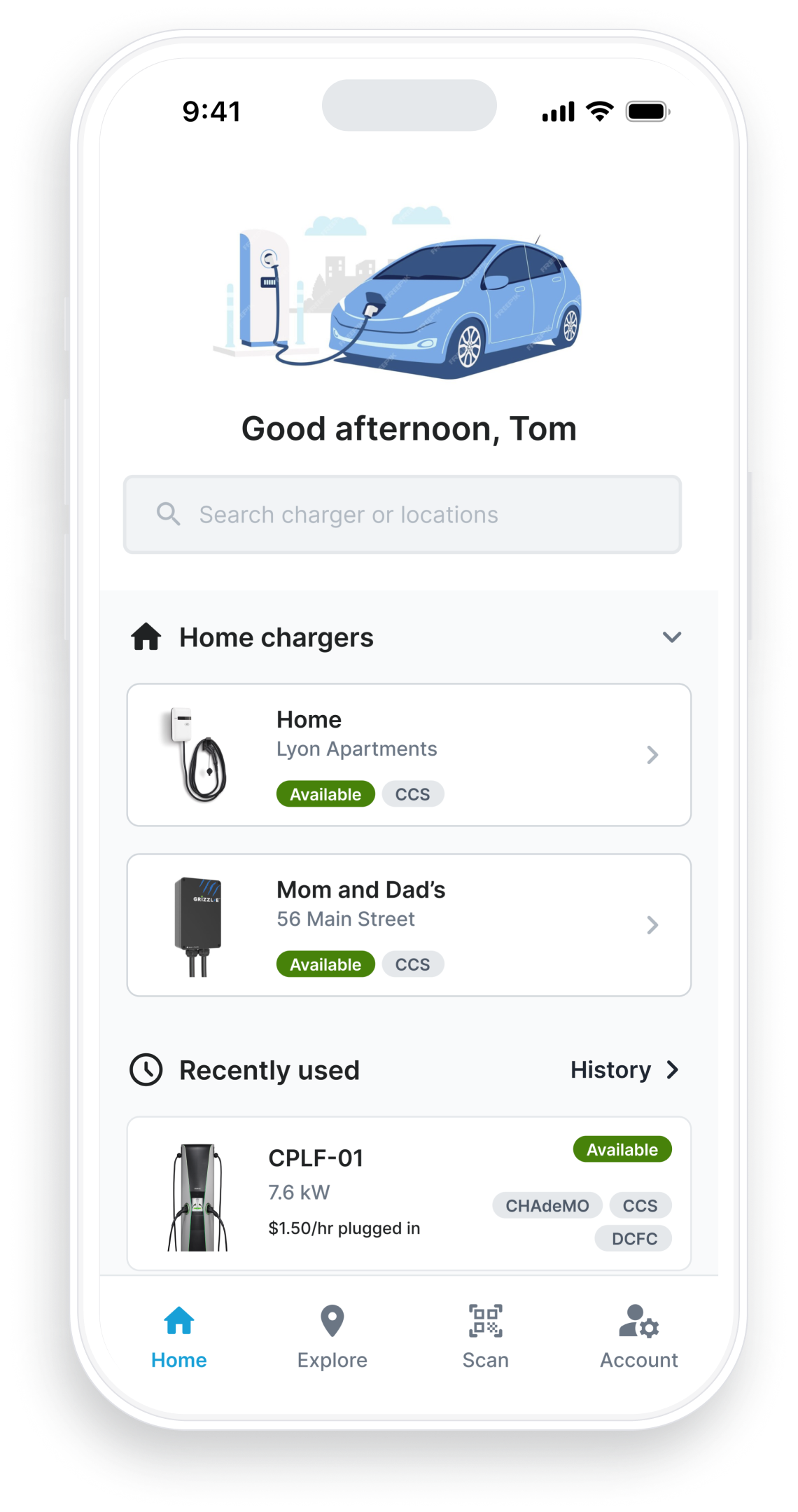
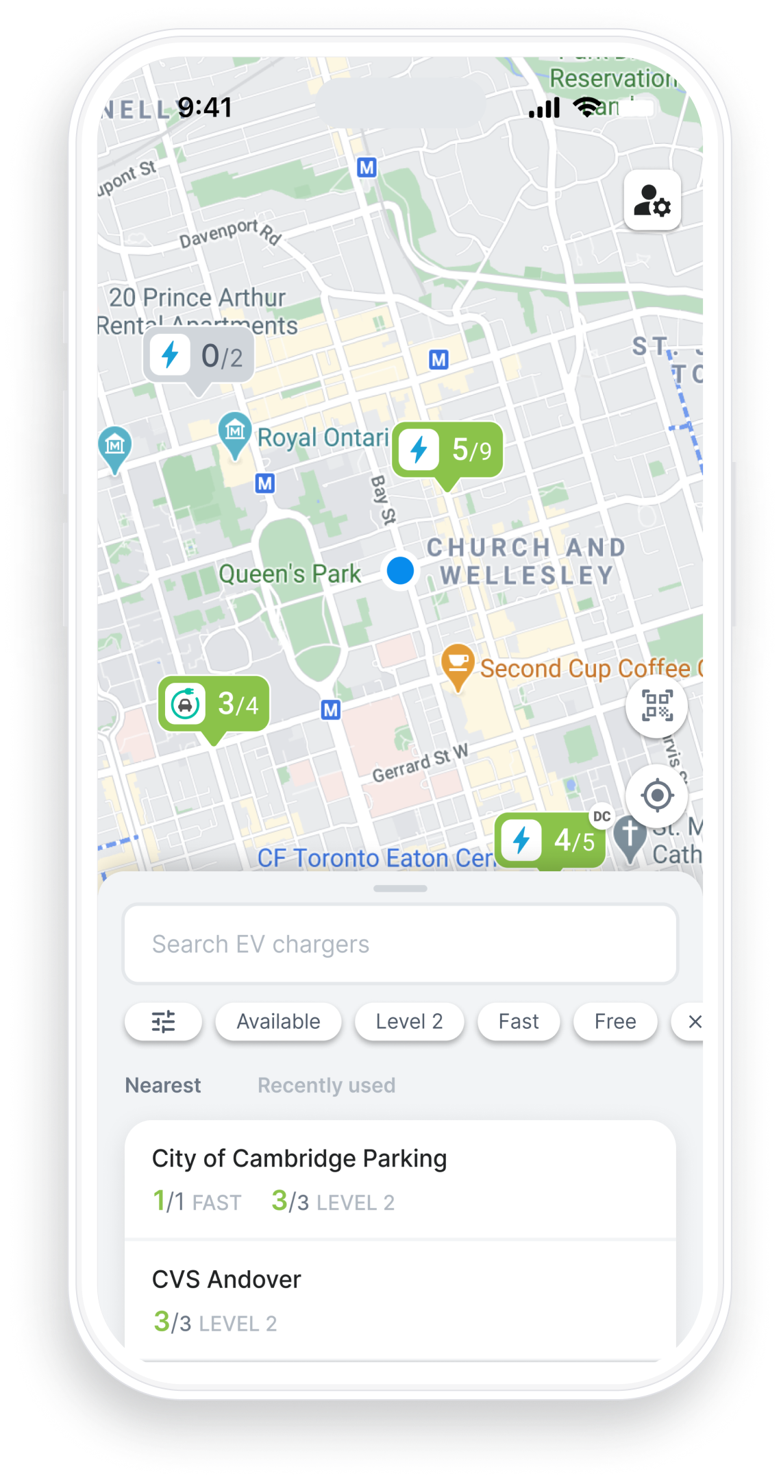
One of the mobile app’s key objectives is to help EV drivers locate chargers out in the world. With the knowledge that this would be the majority of drivers’ rationale for opening the app, I redesigned the app’s overall layout to focus on charger discovery.

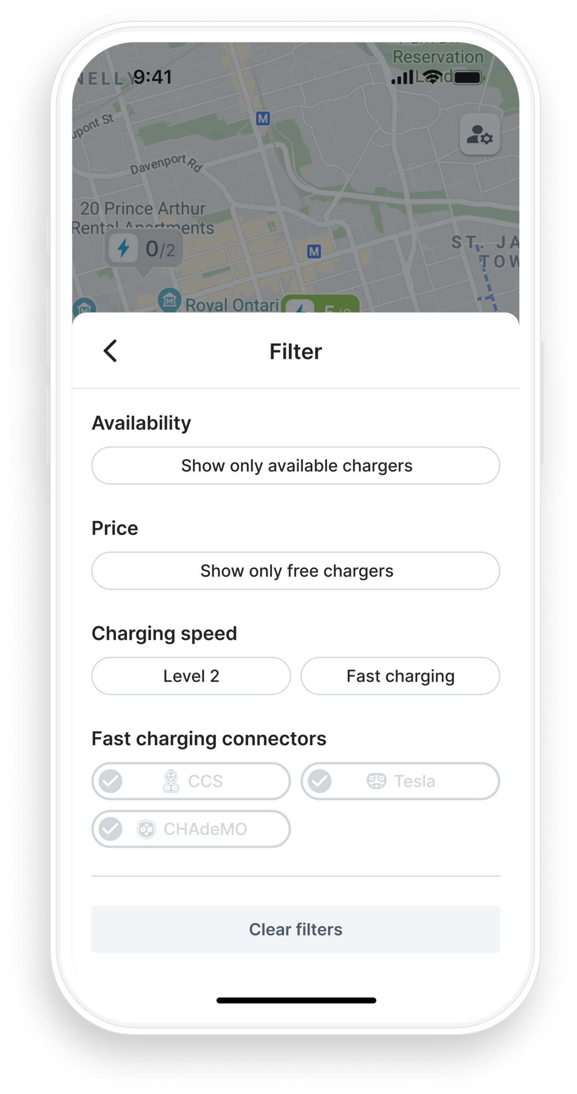
This approach meant that nearby chargers were only a tap away, while robust filtering capabilities helped drivers with more specific needs find what they were looking for. All of these features were positioned at the bottom of the phone screen on a single card, which could be resized and repositioned to make room for the map. These decisions ensured that everything the driver might need was easily accessible, while also providing a solid framework to iterate in the future.

The new, single-card layout for the app allowed us to place the focus on finding a charger as quickly as possible...

...while providing room to iterate and expand in the future.

To timeline

© Tom Garncarz 2025

Tom Garncarz

Product Designer

Send me an email!

EV Driver Mobile/Web App

ChargeLab

//

May 2022 - present

Interaction design

Information architecture

B2C

Mobile

User research

Climate

One of ChargeLab’s main products is a web and mobile application for helping electric vehicle (EV) drivers locate and use chargers.


Over the course of my time as the sole designer—followed by head of design—at ChargeLab, I completely redesigned both driver apps, with the goal of creating a fast, frictionless, and consistent experience on both platforms.
Focal points

This section focuses in on a few specific user insights and how they informed my design decisions.

Speedy start

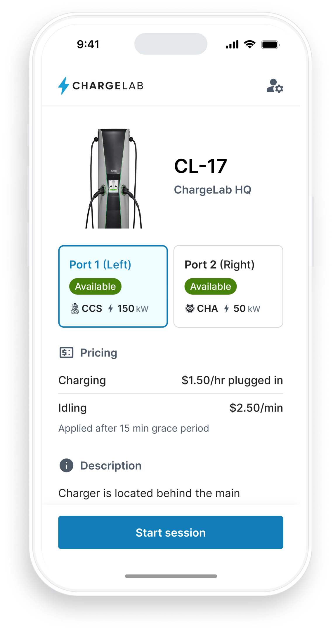
Because the infrastructure for EV charging is very much a work-in-progress, EV drivers often have to contend with a number of different services to find and use a charger, many requiring the user to download and learn a whole new app. Participants in driver research frequently expressed frustration with this slow start-up time, when they just wanted to get back on the road.

To achieve these goals, I redesigned the charging session workflow, with a focus on minimizing friction, surfacing only the most useful information, and avoiding the jargon that’s unfortunately common across the industry. I also designed this workflow to work in both the native and the web-based version of the app, allowing users to skip that extra app download.

The result is a workflow that puts EV drivers on a fast and clear path to getting back behind the wheel.

Many, many of our users are first-time EV drivers, meaning they often don’t know what to do when they pull up to a charger. It was important to segment each step in the process, while providing lots of feedback along the way.

Exploring the map

One of the mobile app’s key objectives is to help EV drivers locate chargers out in the world. With the knowledge that this would be the majority of drivers’ rationale for opening the app, I redesigned the app’s overall layout to focus on charger discovery.

This approach meant that nearby chargers were only a tap away, while robust filtering capabilities helped drivers with more specific needs find what they were looking for. All of these features were positioned at the bottom of the phone screen on a single card, which could be resized and repositioned to make room for the map. These decisions ensured that everything the driver might need was easily accessible, while also providing a solid framework to iterate in the future.

The new, single-card layout for the app allowed us to place the focus on finding a charger as quickly as possible...

...while providing room to iterate and expand in the future.

Back to the timeline

© Tom Garncarz 2025

Tom Garncarz

Product Designer

Send me an email!

EV Driver Mobile/Web App

ChargeLab

//

May 2022 - present

Interaction design

Information architecture

B2C

Mobile

User research

Climate

One of ChargeLab’s main products is a web and mobile application for helping electric vehicle (EV) drivers locate and use chargers.


Over the course of my time as the sole designer—followed by head of design—at ChargeLab, I completely redesigned both driver apps, with the goal of creating a fast, frictionless, and consistent experience on both platforms.
Focal points

This section focuses in on a few specific user insights and how they informed my design decisions.
Speedy start

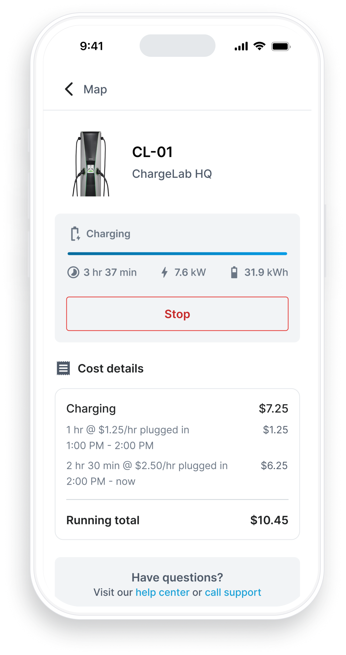
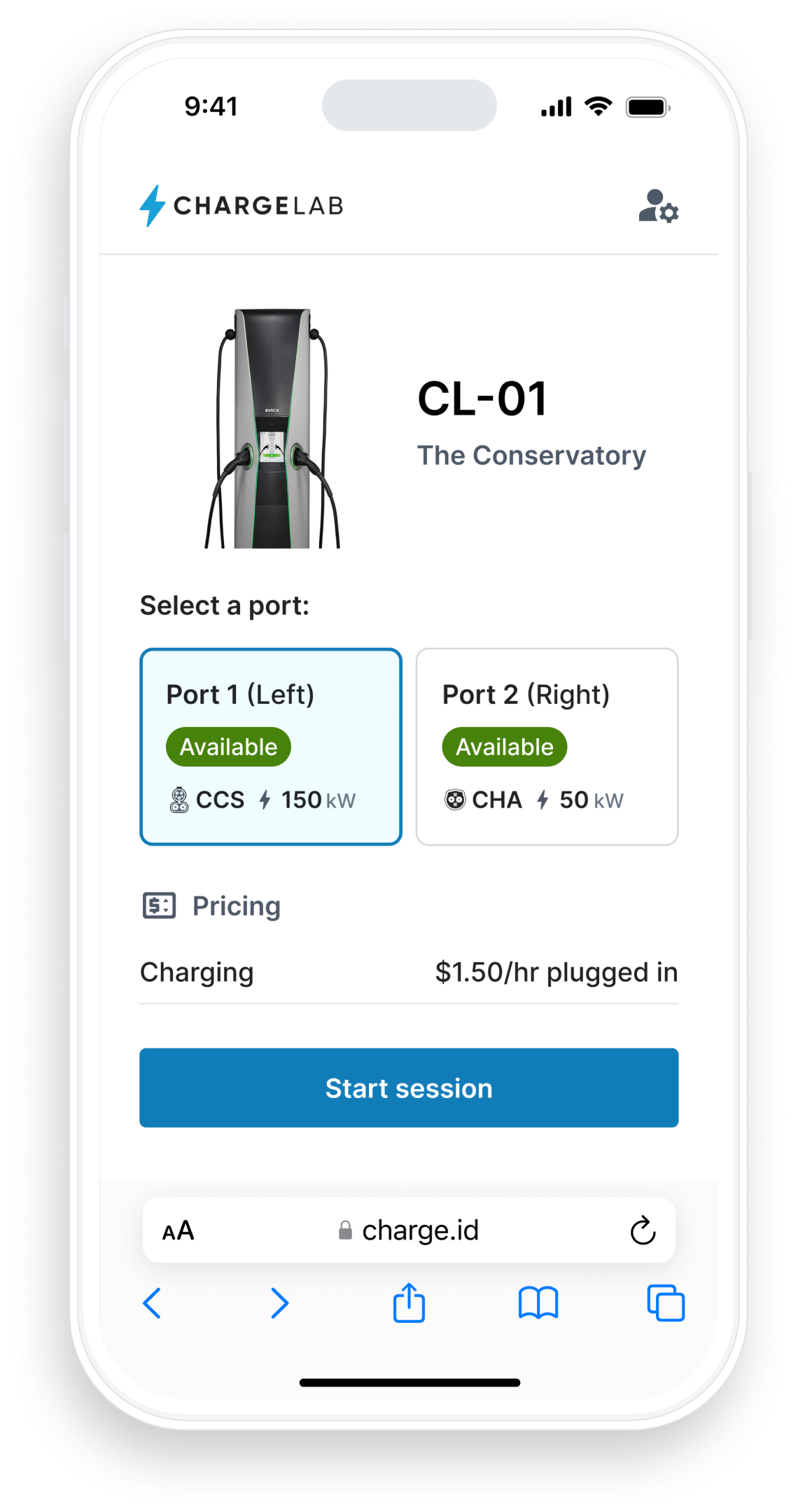
Because the infrastructure for EV charging is very much a work-in-progress, EV drivers often have to contend with a number of different services to find and use a charger, many requiring the user to download and learn a whole new app. Participants in driver research frequently expressed frustration with this slow start-up time, when they just wanted to get back on the road.

To achieve these goals, I redesigned the charging session workflow, with a focus on minimizing friction, surfacing only the most useful information, and avoiding the jargon that’s unfortunately common across the industry. I also designed this workflow to work in both the native and the web-based version of the app, allowing users to skip that extra app download.

The result is a workflow that puts EV drivers on a fast and clear path to getting back behind the wheel.

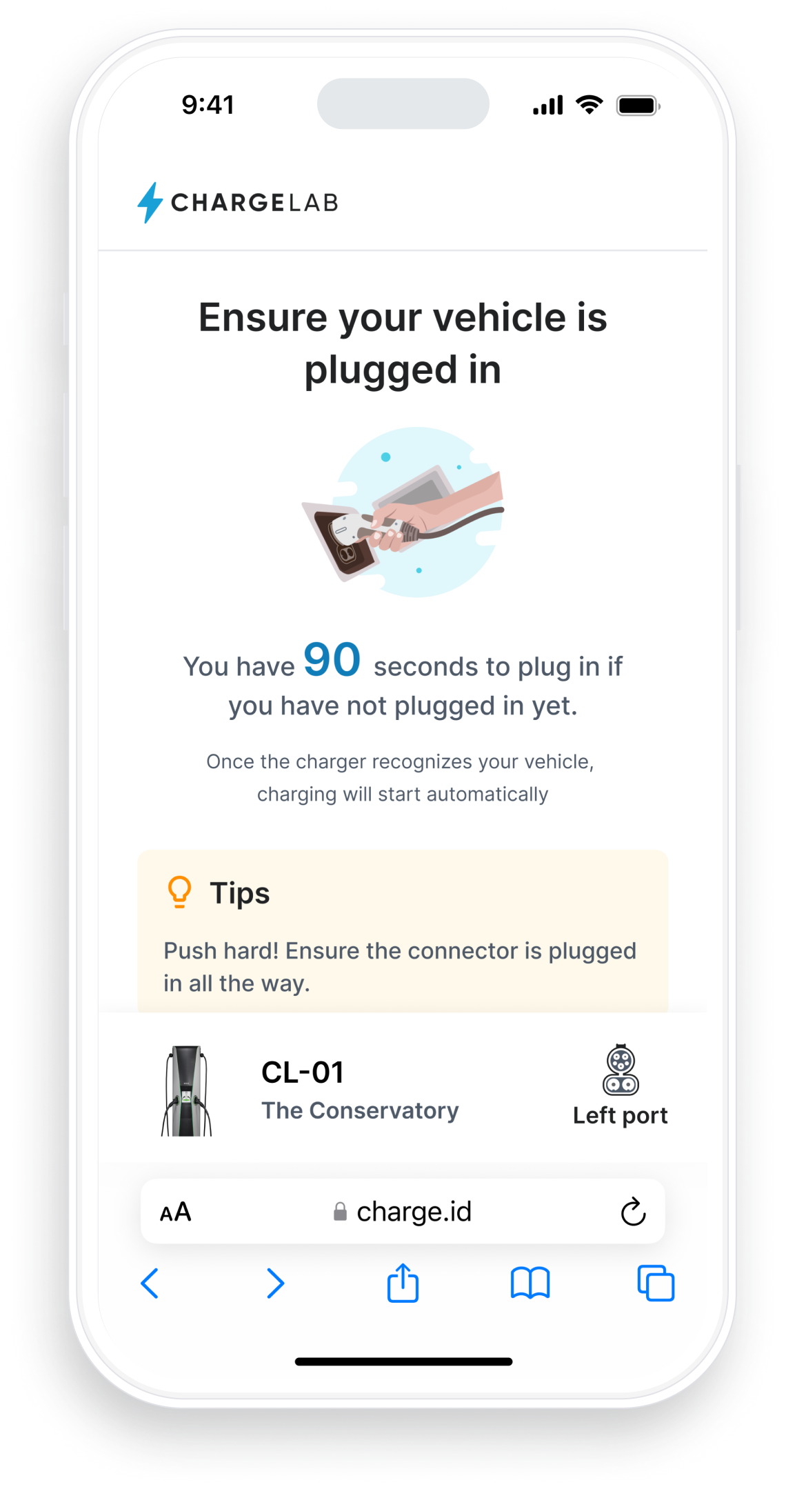
Many, many of our users are first-time EV drivers, meaning they often don’t know what to do when they pull up to a charger.

I had to take care to segment each step in the process, while providing lots of feedback along the way.
Exploring the map

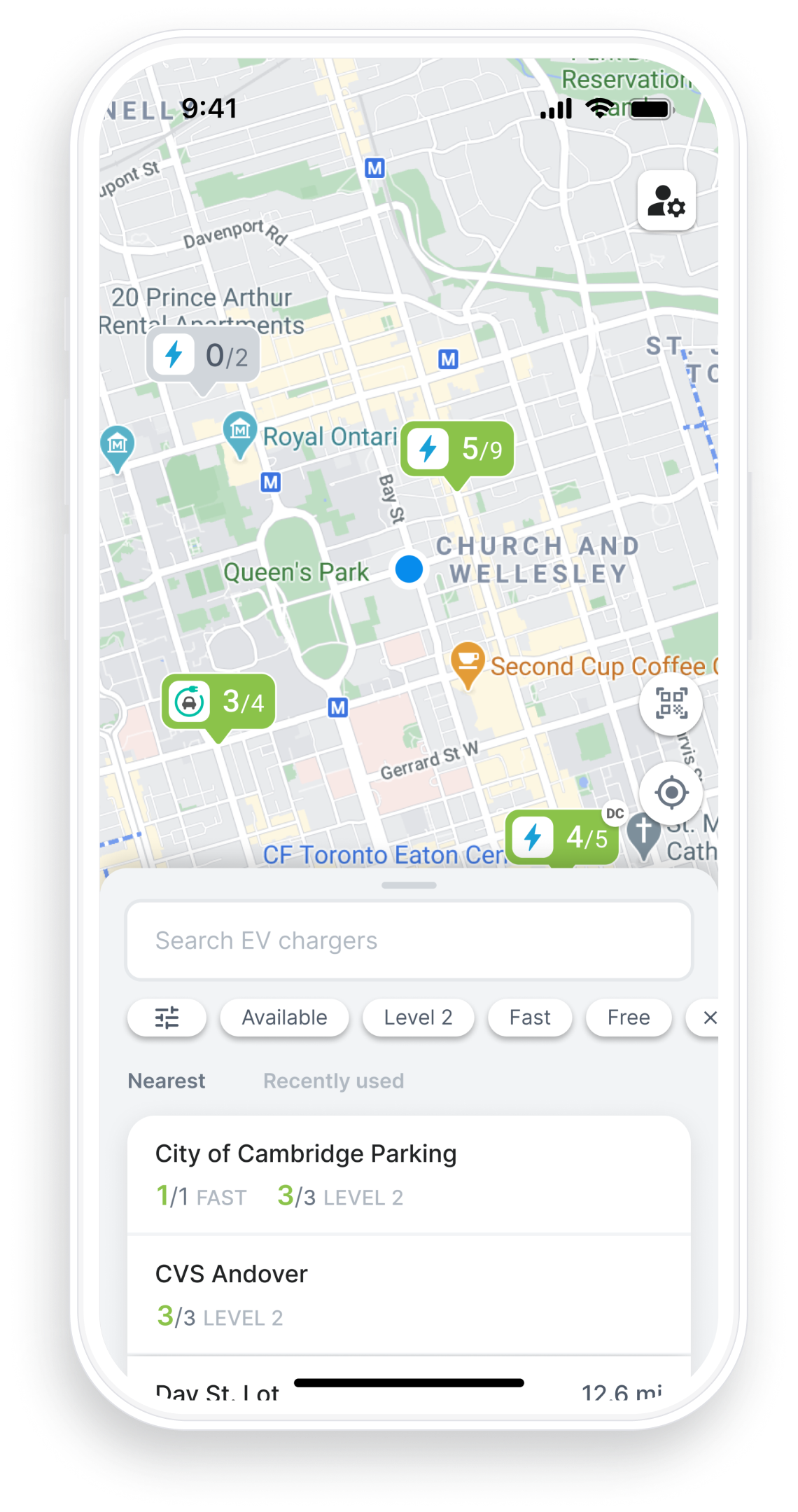
One of the mobile app’s key objectives is to help EV drivers locate chargers out in the world. With the knowledge that this would be the majority of drivers’ rationale for opening the app, I redesigned the app’s overall layout to focus on charger discovery.

This approach meant that nearby chargers were only a tap away, while robust filtering capabilities helped drivers with more specific needs find what they were looking for. All of these features were positioned at the bottom of the phone screen on a single card, which could be resized and repositioned to make room for the map. These decisions ensured that everything the driver might need was easily accessible, while also providing a solid framework to iterate in the future.

The new, single-card layout for the app allowed us to place the focus on finding a charger as quickly as possible...
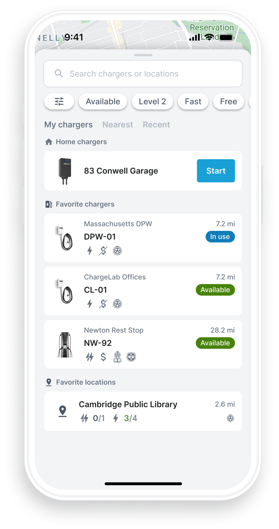
...while providing room to iterate and expand in the future.